
Three colours vs six: building a small acrylic palette
A practical Elysian Vibes journal comparison, alongside Isha Kamal’s art, of a minimal mixing palette and a six-colour setup for acrylic beginners.
At a glance
| Palette | Strength | Trade-off |
|---|---|---|
| Three colours | Lower cost and focused mixing practice | Some darks and bright mixtures take more work |
| Six colours | More direct warm/cool options | More tubes and more choices to organise |
What a three-colour palette teaches
A three-colour palette keeps the mixing decisions visible. It uses one red, one yellow and one blue as a compact primary set; a six-colour setup can add warm and cool alternatives. Winsor & Newton’s acrylic primary-colour guide demonstrates these mixing systems with named colours. The exact tube names and pigment behavior still matter, so treat the guide as a system to study rather than a promise that every red, yellow, and blue will produce identical results.
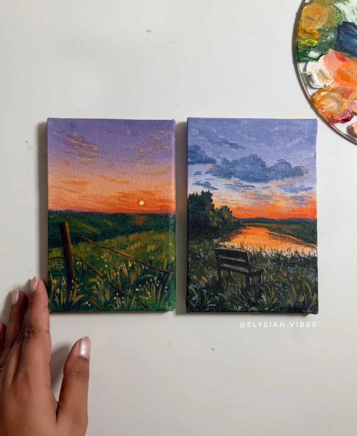
For a beginner, fewer tubes can make a limited palette exercise manageable. You notice which mixes lean green, violet, or orange, and you practise adjusting a mixture instead of reaching immediately for a ready-made colour. That discipline suits the atmospheric landscapes in the Elysian Vibes portfolio, including Isha Kamal’s small studies of sky and water.
Why add three more colours?
Six colours usually means keeping warm and cool versions of red, yellow, and blue. The extra choices can make certain mixtures more direct and reduce the amount of correction needed when a single primary leans away from the colour you want. Winsor & Newton’s guide compares three- and six-colour mixing systems; its examples are tied to its own named acrylic colours, so do not transfer the result blindly to another brand or pigment.
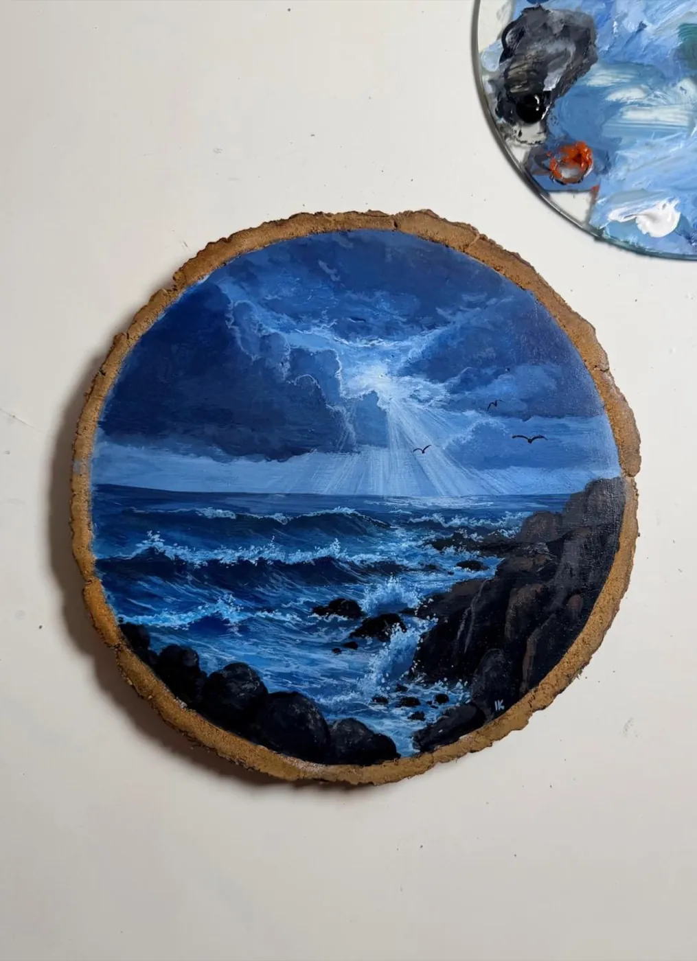
The cost is decision fatigue. A larger palette can make a beginner wonder whether every small shift requires a new tube. Keep a written swatch chart with the paint names and mixtures. Isha Kamal’s work can be a useful visual prompt for studying temperature and value, while Elysian Vibes’ beginner course offers a structured route through colour theory and blending.
Choose the palette you will use
Choose three colours if your priority is learning to mix, carrying a compact kit, or spending less while you practise. Choose six if you already know that warm and cool alternatives will help you reach the subjects and colour relationships you enjoy. Neither palette is automatically more professional, and neither replaces attention to value, surface, and paint consistency.
Before buying a set, make a small chart with the exact colours you plan to purchase. Mix pairs, note the results after drying, and paint a simple study. A focused palette is successful when it helps you make the next painting with confidence, not when it follows a fashionable number of tubes.
References and next steps
For new paintings and studio updates, follow Elysian Vibes on Instagram .