
How to blend acrylic sunset colours without making mud
An Elysian Vibes small-palette exercise inspired by Isha Kamal’s sunset paintings, with practical ways to mix, layer and correct acrylic colour.
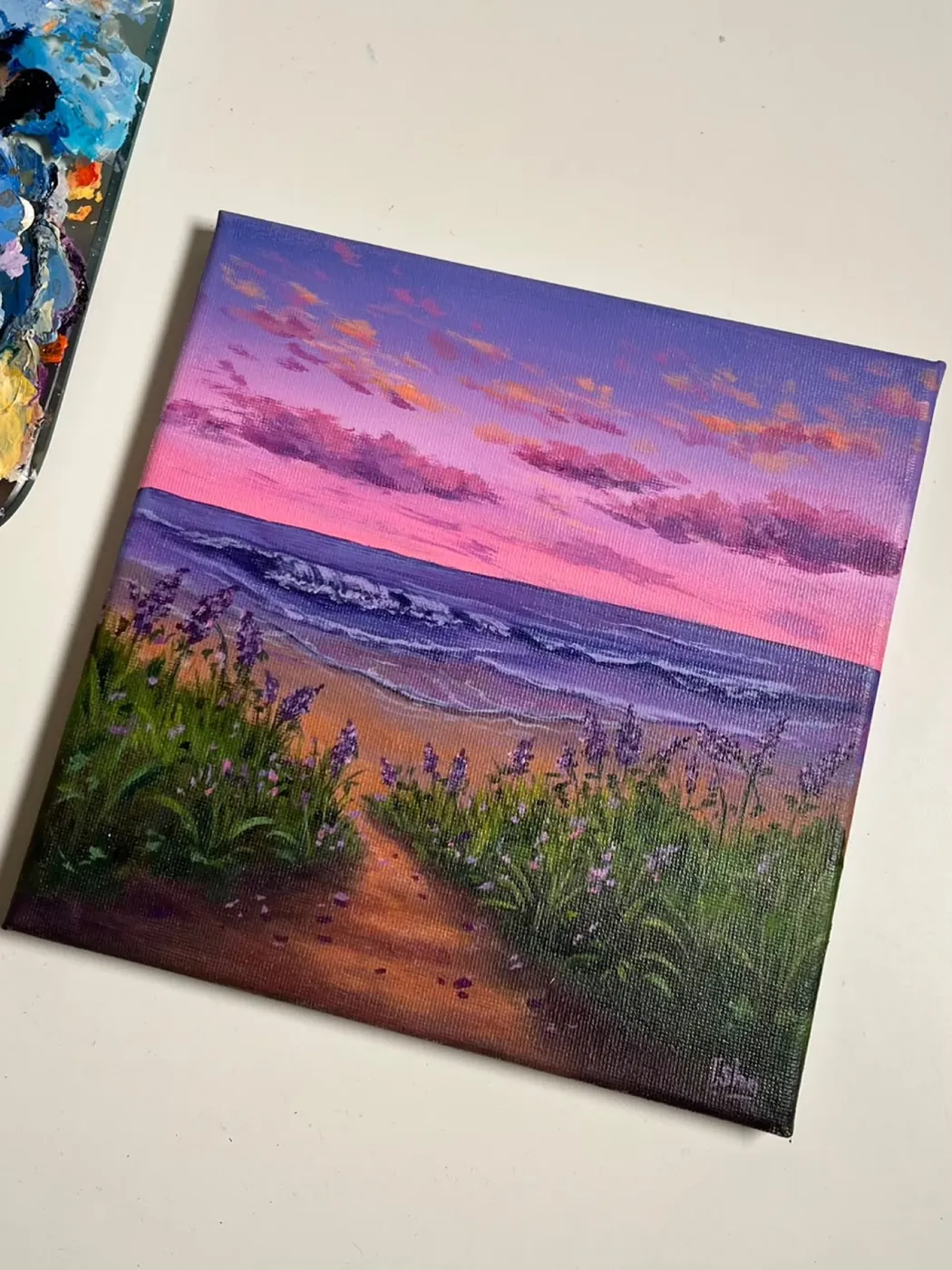
Begin with a small, deliberate palette
A sunset can tempt you to open every warm colour in the box, but more tubes create more chances for accidental mixtures. For this general exercise, begin with one yellow, one red or magenta, one blue and white. Winsor & Newton lists three-colour acrylic systems and recommends transparent colours for clean mixing; its exact suggested pigments vary by paint range. Elysian Vibes shares Isha Kamal’s colourful portfolio as visual inspiration, with a practice exercise to try using your own paints.
Before touching the painting surface, make a short row of mixtures. Combine yellow with a little red for orange, red with a little blue for violet, and each colour with white for lighter steps. Use a separate brush or wipe the brush thoroughly between the yellow-orange and blue-violet families. The goal is not a perfect colour chart. It is to learn which pairings stay lively and where your particular pigments turn neutral.
Source: Winsor & Newton acrylic primary-colour systemsBuild acrylic foundations in the beginner course
Work in neighbouring colour zones
Plan the sky as neighbouring zones: perhaps pale yellow near the light, orange and pink through the middle, then violet or blue above. Mix enough of the main colours before you start. Acrylic paint can become harder to move as it dries, so work on a manageable area and overlap adjacent zones while their edges are still workable. Use light, repeated strokes across the boundary instead of dragging one loaded brush through the whole sky.
Keep the brightest yellow away from a brush carrying blue or violet. Yellow mixed with blue can turn green; yellow and violet are complementary colours that can mix towards a neutral. Either shift can interrupt the warm glow you intended. A narrow pink or red transition can act as a bridge. If a boundary becomes dull, stop blending it. Let the area dry, remix the intended colour on the palette, and apply a thin corrective layer rather than repeatedly stirring the wet surface.
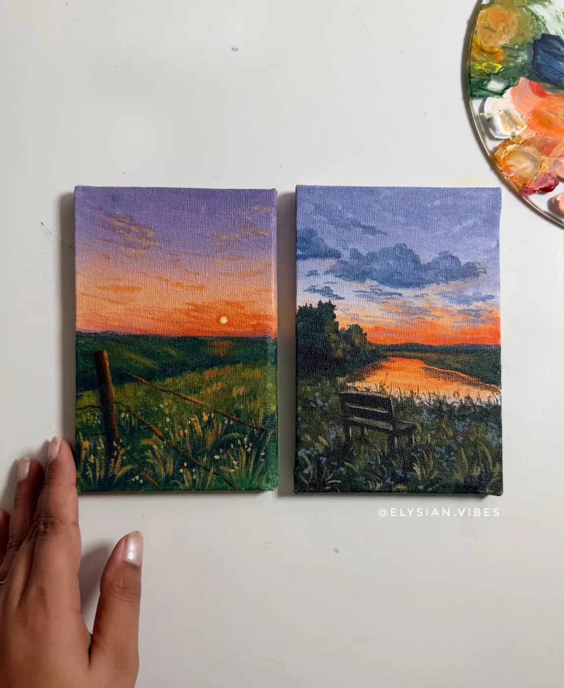
Pause, compare, then make small corrections
Step back before adding clouds, silhouettes or reflected light. Ask whether the value pattern still reads: is the lightest area easy to find, and does the upper sky feel distinct? If everything has become equally pale, restore one darker mixture at the top. If every transition is equally smooth, preserve a few firmer cloud edges or bands of colour so the sky has structure. Make one adjustment at a time and reassess it from a distance.
Save your palette notes or photograph the labelled mixes for the next attempt. That record is more useful than memorising a universal formula because pigments differ between ranges. When you want to study a finished atmosphere, view A violet path to the sea in the Elysian Vibes shop; it is an original portfolio work by Isha Kamal. For guided fundamentals such as colour theory, blending and layering, the beginner course is the relevant next step.
View A violet path to the seaExplore the acrylic beginner course
References and next steps
For new paintings and studio updates, follow Elysian Vibes on Instagram .